 Back to the beginning
In 2009, before Steve and I started our own studio, we stayed at the Carpe Diem Guesthouse in Provincetown, Ma. This was an extraordinary property with very ordinary marketing that did not reflect the world class level of the Inn. As a test to see if Steve and I could work together successfully as a team, we decided to redesign the Inn's marketing for free. We didn't let the owners know what we were up to, just in case we never produced anything worthwhile. We worked on Carpe in-between projects and in our spare time. Within six months we had created new branding for the inn and its sister-property Namaste Spa, along with a new website, brochures, advertising, signage, and merchandising. We sent the owners our presentation and they were thrilled with our new ideas. Not only did they say yes to what we offered, they actually paid us for our work! And so, Boost Studio was born.
Reboost it
Five years later and after our merger with DFM, our studio is now a full-size agency and we are excited to have the opportunity to redesign the Carpe Diem Guesthouse and Namaste Spa website once again. The challenge this time around is not only to design a new look that works with the existing brand, but to design a responsive website that offers a new level of interaction, intuitive navigation, and simplicity that we have never before achieved. The Inn's site is quite complex and showcases 19 unique rooms and multiple common areas, a full-service Spa, and all the luxury amenities of the Carpe experience.
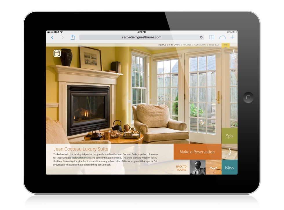
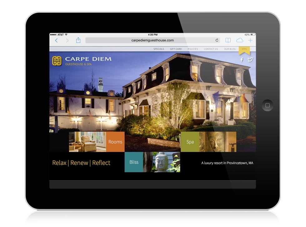
We gave ourselves a laundry list of must haves: large photos, minimal clicking and simple navigation across every device, and each of the three main areas clearly defined with it's own distinctive look. Our main nav is three colored squares for rooms, spa, and experience or "bliss". These nav squares are integrated into every page throughout the site for ease of use and they add a pop of color without being overpowering. We paid special attention to the layout of the room pages that now offer large photos, amenities, large room diagrams, and room location map, with a link to make a reservation always at hand. We also branded the room reservation landing page provided by an external web service to ensure a seamless transition to and from the site. To minimize clicking and re-loading of photos on tablets and phones, we designed scrolling pages from top to bottom and side to side. This allows the visitor to view the maximum number of photos and information at one time. And finally, every page we designed allows extra room for longer text when viewing the site in French or German.

